I can clearly recall my mother's disappointment once she realised she couldn’t listen to the radio through her new iPhone. Which made total sense to me.
At the time there was only a built-in app called Podcasts that allowed you to listen to podcasts. Also, Generation Z's complete lack of interest in the radio experience had already signaled the start of a new era. Podcasting, once an obscure process of transmitting audio content, had now become a distinguished medium for its distribution.
When old media are replaced by new ones, some of their features are dropped ‘cause they no longer serve a purpose. Podfast was inspired by the original process of discovering new radio stations through AM/FM scanning, a process so undoubtedly joyous and adventuresome for quite a few people that there's even a hobby invented for indulging in it, called DXing. My idea was that the concept of radio discovery can incorporate so much more user value than just the induction of nostalgic feelings to the users (like, creating a typewriter app does, for example). Since ideas transcend media, its essence could be rebottled and repurposed for the Podcast era and even be further expanded.
I thought hard on the radio discovery process and I found that the main characteristics defining it are:
- Chance: In case you don’t tune in to your favourite program in time, chance is always involved in the program you will tune in to eventually, also in its elapsed time.
- Audio Cues: instead of visual cues. Even though you can see which frequency corresponds to a specific position of the knob, only the audio provides you with information about whether you are going to like what you hear or not.
- Locality: When you move to another country or region, you will tune in to entirely different stations.
Implementation
Getting started, at the top level, I described what I was trying to build in the form of a simple user story:
As a listener I want to discover podcasts by scrolling while listening to them
This was pretty much it. This single user story has since spawned a lot of other stories, tasks, sub-tasks etc. These sub-stories all revolve around the three above-mentioned characteristics. The process was: (a) think of a scenario (b) write code that implements it (c) assess the value it adds for the user (d) integrate it into the app. That's how I made an iOS app prototype pretty quickly, implementing this user story into local podcast audio files and just a UISlider.
My next step was to use some real data sources. I turned to iTunes RSS Feed Generator, a publicly accessible API which returns a JSON file with the Top 100 Podcasts in different regions, regularly updated on an almost weekly basis. After collecting this data I had to jump through some hoops - I won’t bore you with the details - to get the metadata for each podcast (XML RSS feed parsing anyone? 😁) but thankfully, the podcast RSS feed tags are properly standardized in order to get parsed by iTunes, Spotify etc.
At this point, I realised that the less the app's core logic knows about the specifics of the various data sources, the better for the app. To achieve this separation, I spent some weeks researching the most common app architecture patterns and ended up re-writing my hacky/scripty view controller logic by using something very similar to Viper and Uncle Bob's clean architecture but not exactly any of them. For those of you who are interested, you can take a look at the folder called Use Cases and let me know what you think (I’m suspecting I have committed some over-abstraction crimes here). Anyway, my goal behind all this was very clear: I wanted to be able to switch data sources on a whim, without having to re-write half of my app. This proved to be very valuable when remote configuration feeding podcast data was added.
I also noticed that podcasts could be organised by category and that was pretty neat, since such a minimal visual cue is not prominent enough to distract the user from listening. Finally, I replaced the slider with a UICollectionView to display the category names and also wrote some simple collision logic:
That was the prototype I showed to the visual artist/writer Vasia Bakogianni, also known as @kroutsef and asked her to work as a graphic designer for the app. She took it all in and we got straight to work. After a few interesting conversations, brainstorming sessions and design iterations she came up with the app icon:

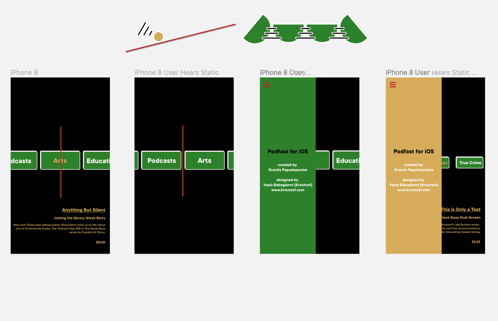
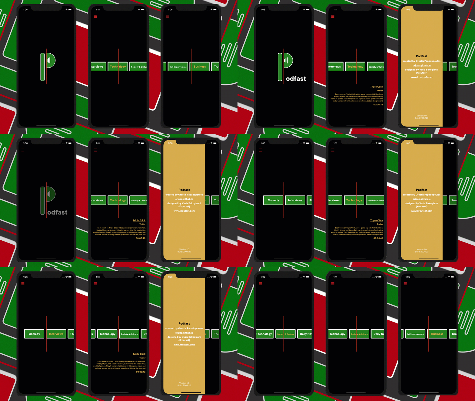
Vasia has not only worked as a designer for the project, but since she is an avid podcast listener, she has also provided valuable feedback on the user experience, as well as hours of interesting app and non-app related conversations. After taking a short break, where we had to work on various other projects, we got back to ‘Podfast’ and decided to push towards the app release by setting a strict release date. Since we’d done a lot of groundwork and the concept had already been solidified, we finalized the designing aspect of it shortly after:

From a software perspective we agreed on a subset of features that would be included in the release, a sort of minimum viable product (MVP) approach, based on the following principle: before making a significant time and effort investment we have to set out to release the product, deliver it to the users and then channel their input back into the process of development.
Shortly prior to the big release, I realised that since there is streaming involved and the loading time experience ranges from “seemingly instant” to "slower than death caused by a natural cause”, we needed a way to indicate the buffering state. We decided to go with something different from the established spinner/loader pattern and use radio static sounds. The current, simplified implementation has a static sound sample played when AVPlayer is having a rough time buffering. Of course, there is definitely room for improvement by obviously inserting procedural sound design into the concept. Spinners are the ultimate playground for graphic designers, so let's also give sound designers the opportunity to indicate loading states.
Over a period of one week and a few micro-features later, some of which are:
- Categories are sorted out by “most listened”
- A listen is defined as “1 minute of listening”
- Podcast details appear after 30 seconds of listening to a podcast, in order to encourage the listener to pay attention to the audio.
- The episode seek time is related to the app's start time.
- Curated podcast sources can by dynamically added to the data set. Thanks to Firebase Remote Configuration,
we finally had our 1.0 release!

Where to next?
You can download the app for free from the App Store and give it a try.
Our users have already done a great job sharing their feedback with us. We are bound to release an update soon, with improved features that were assimilated thanks to their suggestions. We would also love to hear your own feedback on the app Send us an email or get in touch on Twitter @orjpap, @kroutsef. Feel free to share with us your favourite podcasts and the category they belong to as well, so we can add them to our collection.
There is still a lot to learn and improve, so further optimization in the departments of streaming logic, sound design and visuals of the app is inevitable. Besides, we’re planning to introduce the parameter of locality mentioned above. Instead of just selecting from the US Top 100 and our curated podcasts, the user will be able to discover podcasts that are popular in their respective country.
An Android app is also in the making by Petros Koutsokeras
The source code is available for free and can be found on Github, I'm open to discussions about the implementation/architecture of the app and points that can and should be improved.
To sum up, I will just quote Vasia's carefully crafted words:
Podfast is, after all, not a digital radio simulation that aspires to send you on a nostalgia trip. It is a tool that re-establishes the user trust in a carefully selected bunch of cultural products picked by the users themselves without strain.

